Note: A/B testing and multi-step checkout are only available through the old checkout. If you are using the new checkout and want these features, switch back to the old checkout.
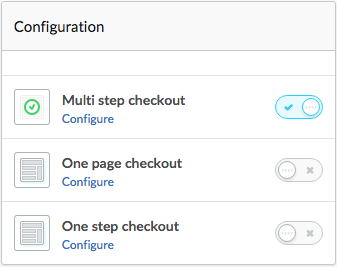
Lightspeed eCom allows you to configure how your customers check out when making purchases through your online store. Access these settings in your eCom admin under Checkout > Dashboard.
You can select one of the following checkout configurations:

You can also run multiple checkout scenarios simultaneously so that you can run A/B testing to determine the most efficient checkout for your customers and business.
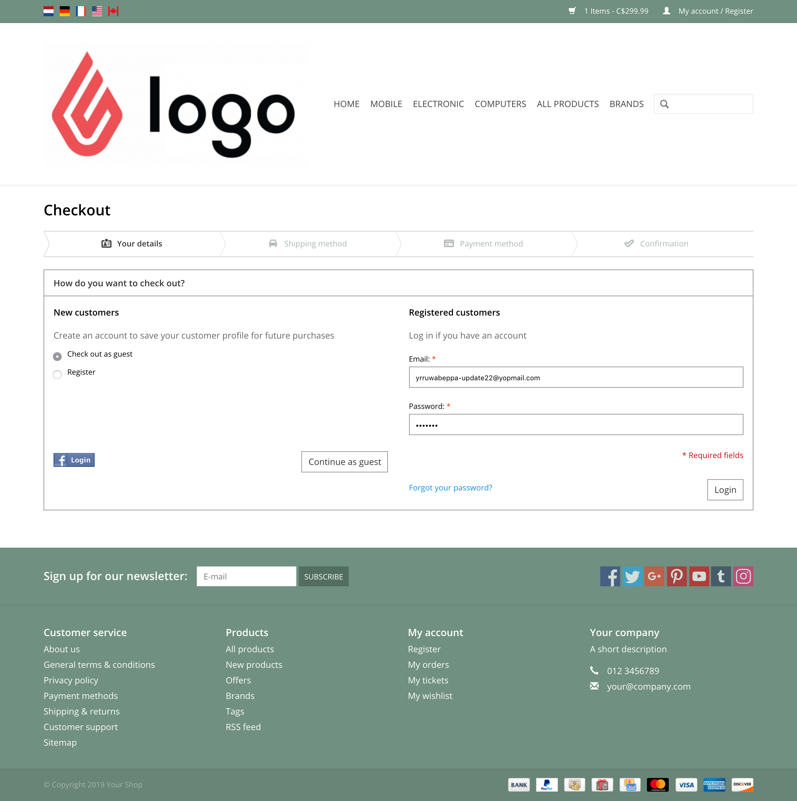
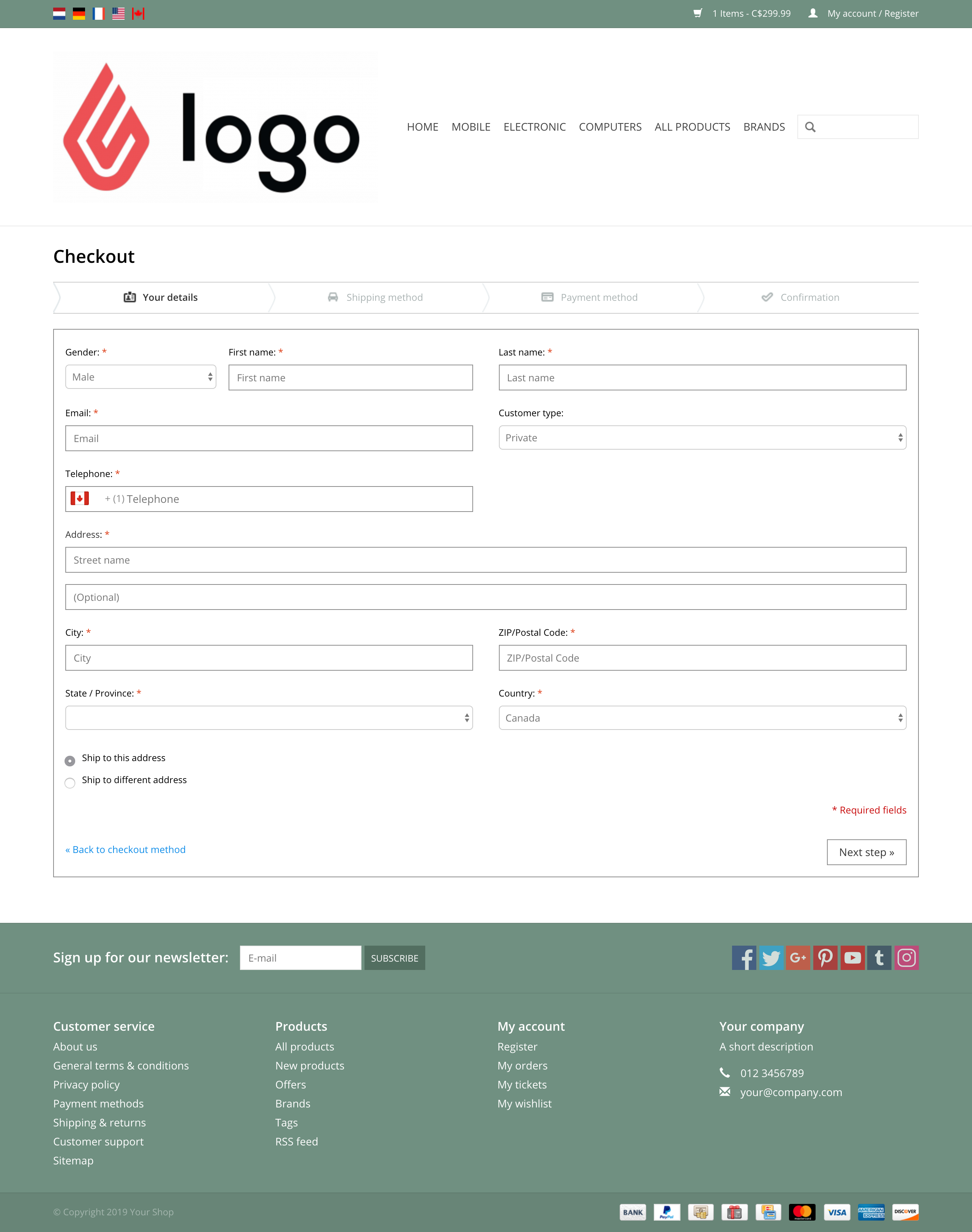
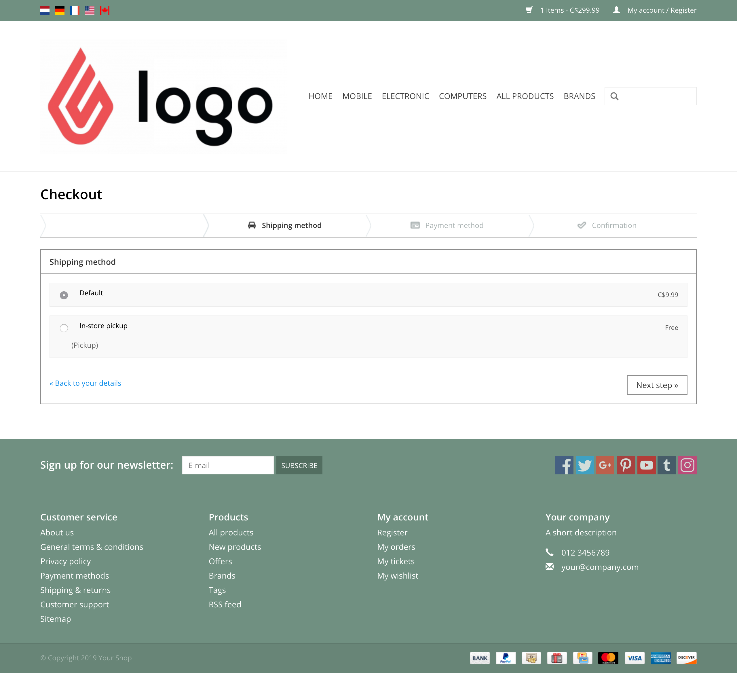
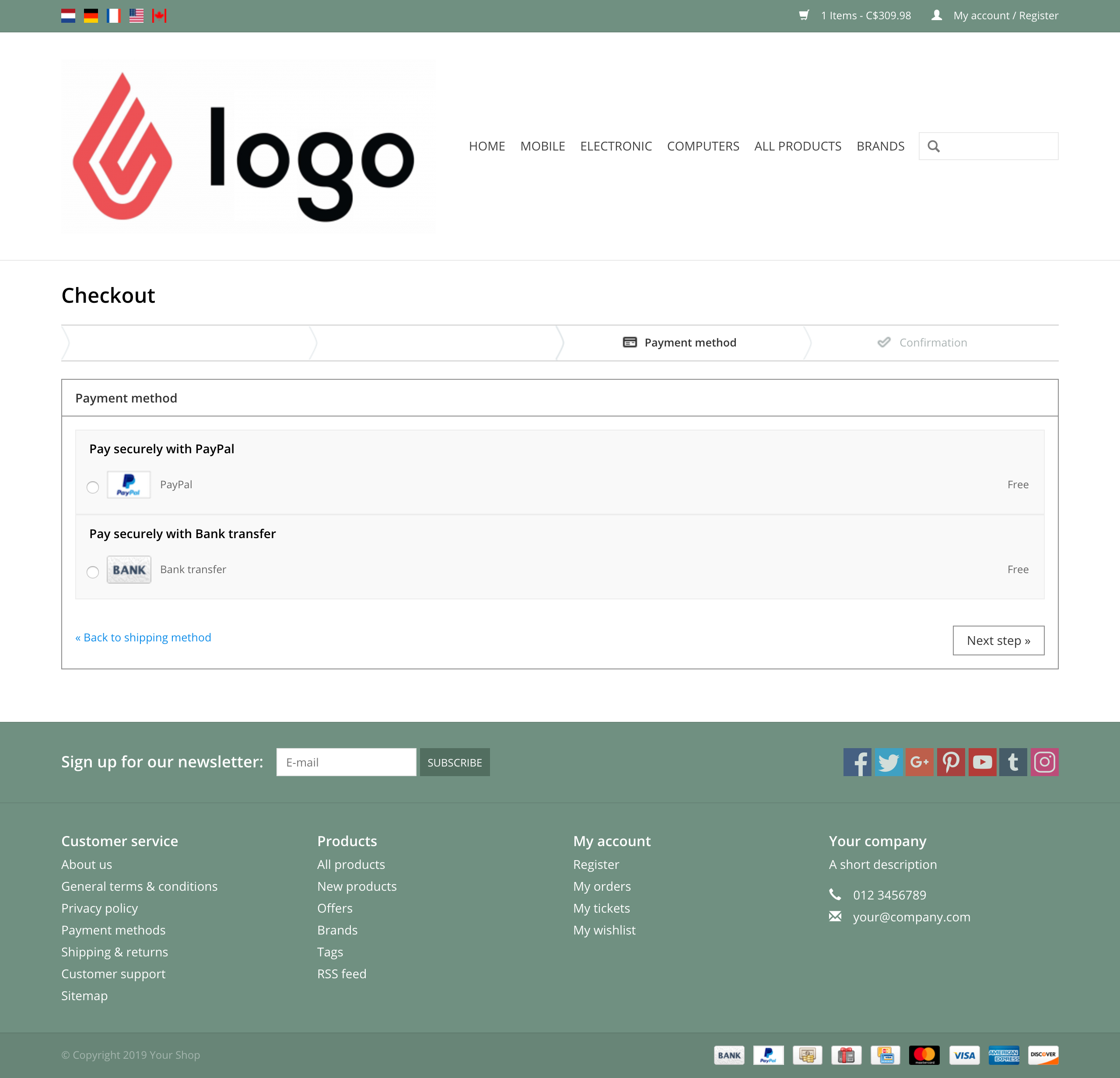
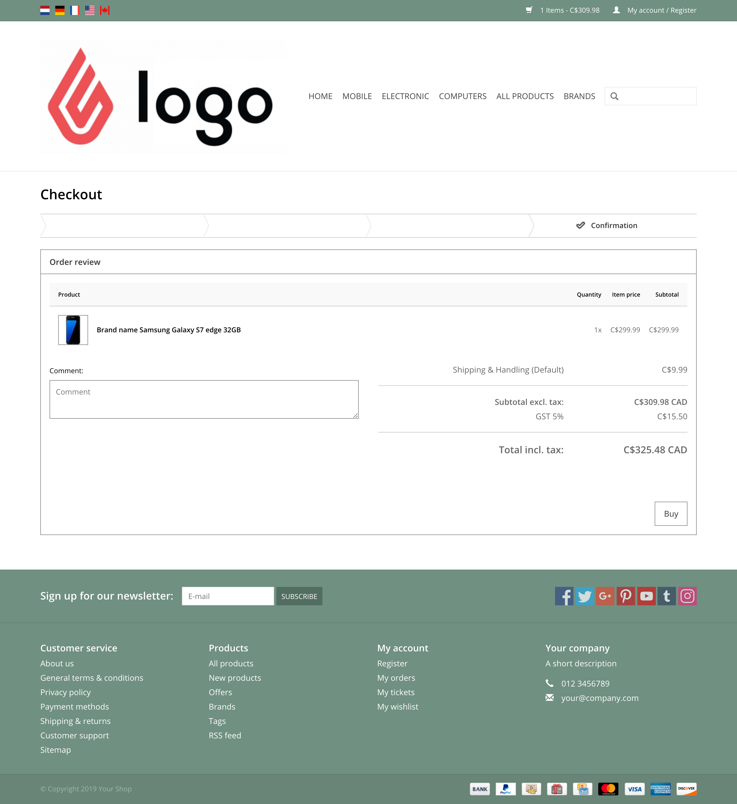
Multi-step checkout
This is the default checkout provided with your theme. Each step involves entering data and/or selecting certain options. Upon completion of a step, your customers simply select Next to proceed to the next step in the process. It consists of five steps:
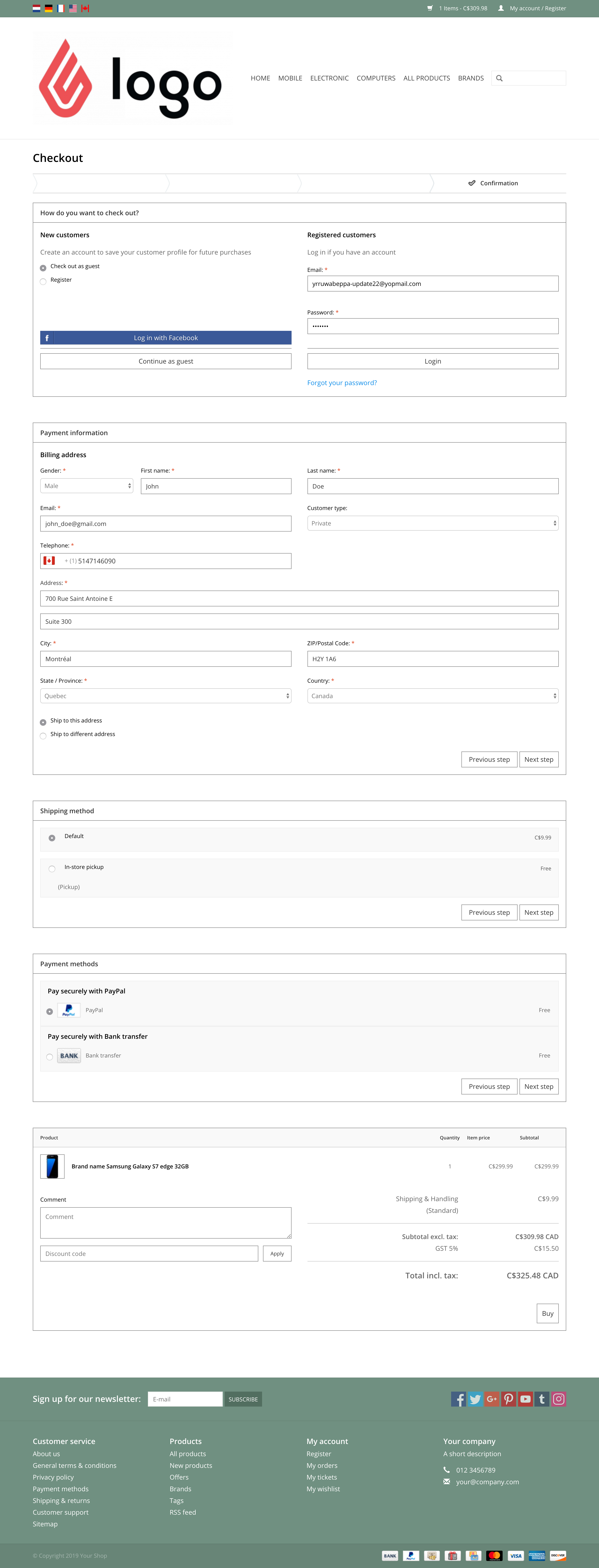
One-page versus One-step checkout
| One-page checkout |
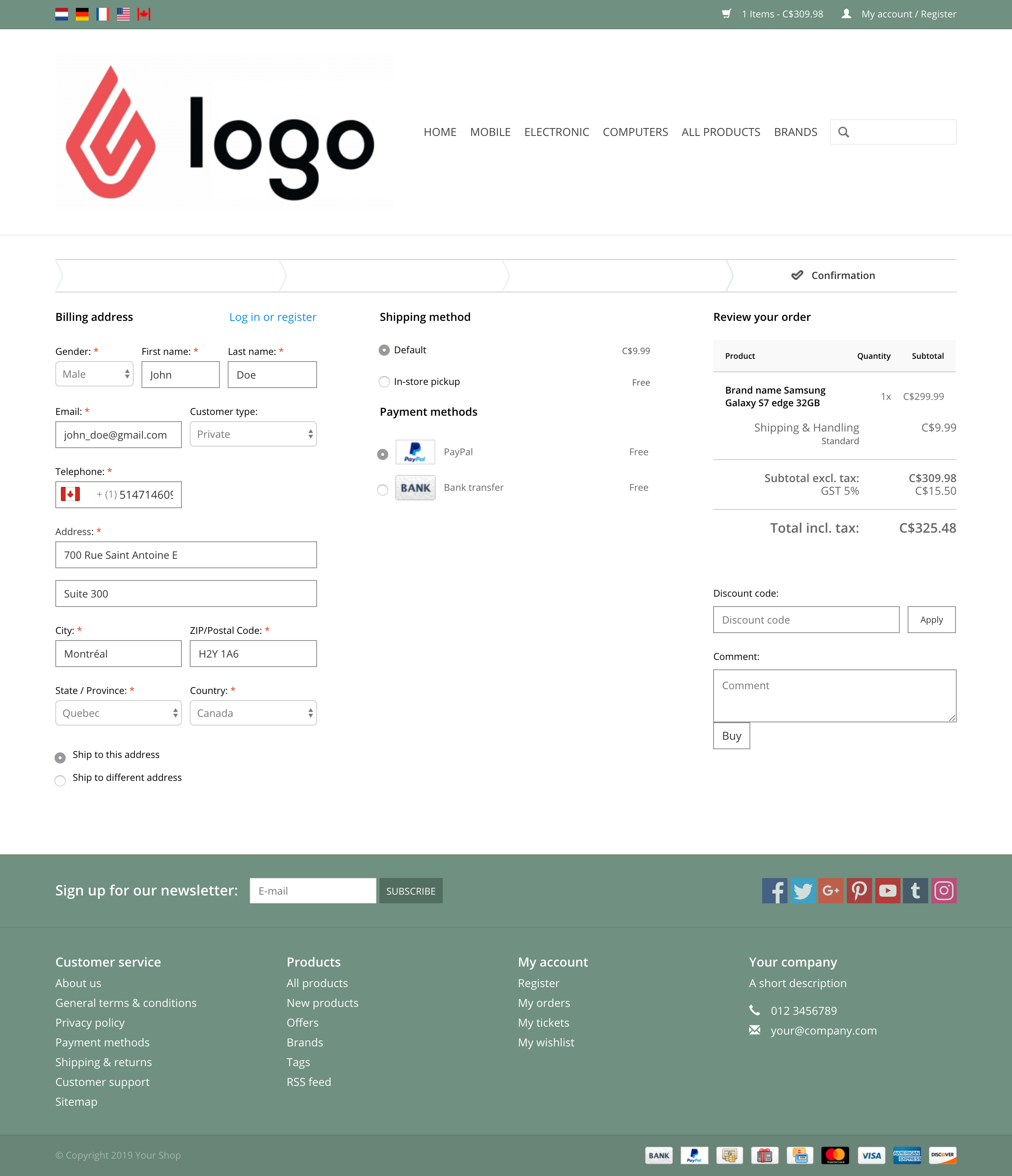
One-step checkout |
| As the name suggests, the One-page checkout consists of an area where your customers enter all their data and make their selections on a single page. All the data and steps are identical to the Multi-step checkout, except that customers are not redirected to a new page after selecting Next. Instead, the system automatically scrolls to the next step on the page. |
The One-step checkout is somewhat similar to the One-page checkout; it too provides all checkout steps on a single page. The main difference with the one-step checkout is that customers proceed through the steps horizontally. Also, this checkout uses a fading effect, which essentially fades successive steps into the background until the customer completes the current step. It is also not necessary for customers to select Next after completing a step; the next step automatically becomes visible. |
 |
 |
Related articles
